Collecting and pinning content other than apps to your launcher is a net new concept to the tablet world. On Kobo Arc, we used a traditional introductory tour to explain why pinning is important and useful to the user.
Subsequently, we further expanded on how users could pin as they entered various spaces. For example, before the user enters the browser for the first time, there is a tour to explain how to pin websites.
We found this approach to be ineffective in communicating concepts to the user. This was reflected in both user testing and metrics in engagement of the pinning feature. This project highlights the key lessons we learned with regard to help content on an interface and the evolution that has resulted from it.
The Starting Point: Quick Tour

This was the screen each user saw just after they finished setting up the device for the first time. The first step was the Quick Tour which was a 90 second video highlighting the key concepts of the interface.
The goal of the quick introductory tour was to communicate a clear and concise value proposition to pinning media. It strived to explain both what pinning was and get the user excited about using the feature. The following highlights some key problems we discovered from this implementation:
Timing
The timing for presenting this tour was flawed. After spending several hundred dollars on a device, taking it home and finally setting it up, the user likely wants to get in and play with the device first. A mandatory tour in the form of a video may catch the attention of a few, but we largely found through usability testing that it was seen as a barrier to getting into and interacting with the device.
Effectiveness
75% of usability testers had difficulty communicating the idea of pinning after going through the initial quick tour and interacting with the device for 10 minutes.
Unfamiliarity
Introductory tours explain interface concepts that the user hasn't seen or used yet. Without a clear frame of reference, it is likely that the user will struggle with what is being communicated.
The Starting Point: Browser Tour – Interface Overlays
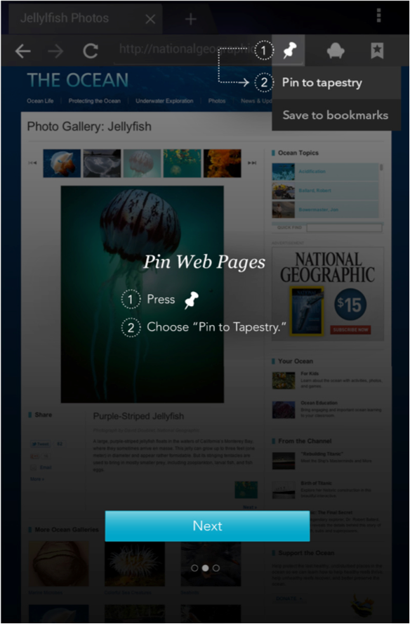
When a user enters the Browser, Gallery or All Apps for the first time, they are presented with a mandatory tour comprised of overlays, educating the user on how to pin from that respective area. This is one of the slides from the Browser tour.
With the introductory tour explaining why pinning is important, we deployed other tours in relevant locations explaining how to pin. This included the Browser, Gallery and All Apps. We found key issues with this approach that are listed below:
Timing
Most introductory tours are flawed for the following reason: The information being presented in the tour oftentimes is completely unrelated to what the user is trying to accomplish at the time. Users opening the browser for the first time, likely want to go to a website they have in mind. Teaching them about pinning the website to a collection is completely unrelated, and hence these tours were oftentimes received as being somewhat annoying.
Overlay Design
The overlay design was used in the tour to show and highlight key interface elements. However, the overlay did not allow users to interact with those elements until the entire tour was finished.
With these flaws in the design listed and thoroughly understood, I began creating concepts on how we could deliver help to the user at the exact moments they needed it and to do so in an unobtrusive manner.
The Concept: Empty State Help

Wireframe of the empty state of a collection. The call to action to learn is embedded in the interface.

When the user taps on the learn more CTA, they are presented with a pop up or flyout that gives them more information.
When a collection is empty, it is ingrained with a first time experience call to action (CTA). This CTA triggers a pop up that explains both WHY and HOW a user can pin media. This approach addresses several problems, listed below:
Timing
The user launches the CTA only when they are curious about what they can pin. We catch the user at a time when they are actually interested in learning something. This is an opportune moment to sell the user on the feature, in addition to teaching them how to use it. This is a vast improvement over the previous strategy of impeding the user from their goals with introductory tours.
Persistence
Every collection will present this CTA in its empty state. It is also viewable through the secondary menu inside the collection at all times. Thus, the messaging is built into the interface and retrievable at any time, unlike introductory tours.
Optional
The user can choose to interact with the CTA - it is completely optional. In this way, we ensure that users who are presented with the content care, or are at least curious about what is being said, leading to higher probability of retention.
Flexibility
Books and magazines from a users library are populated in their own collections. The empty state help design is flexible and has been implemented in these collections as well. They break down the various ways to load books onto an account in an easy, straightforward manner. Believe it or not, loading eBooks onto a Kobo account is one of the highest customer care call drivers so having this information accessible at all times for the user is a huge win in addressing this problem.
This tool allowed us to communicate only a subset of the help messages we wanted to convey. Another one of my concepts gathered traction and was sufficient in communicating the remaining messages.
The Second Concept: Just In Time Toasts - Browser

Wireframe of toast calling out the pinning icon inside the browser.
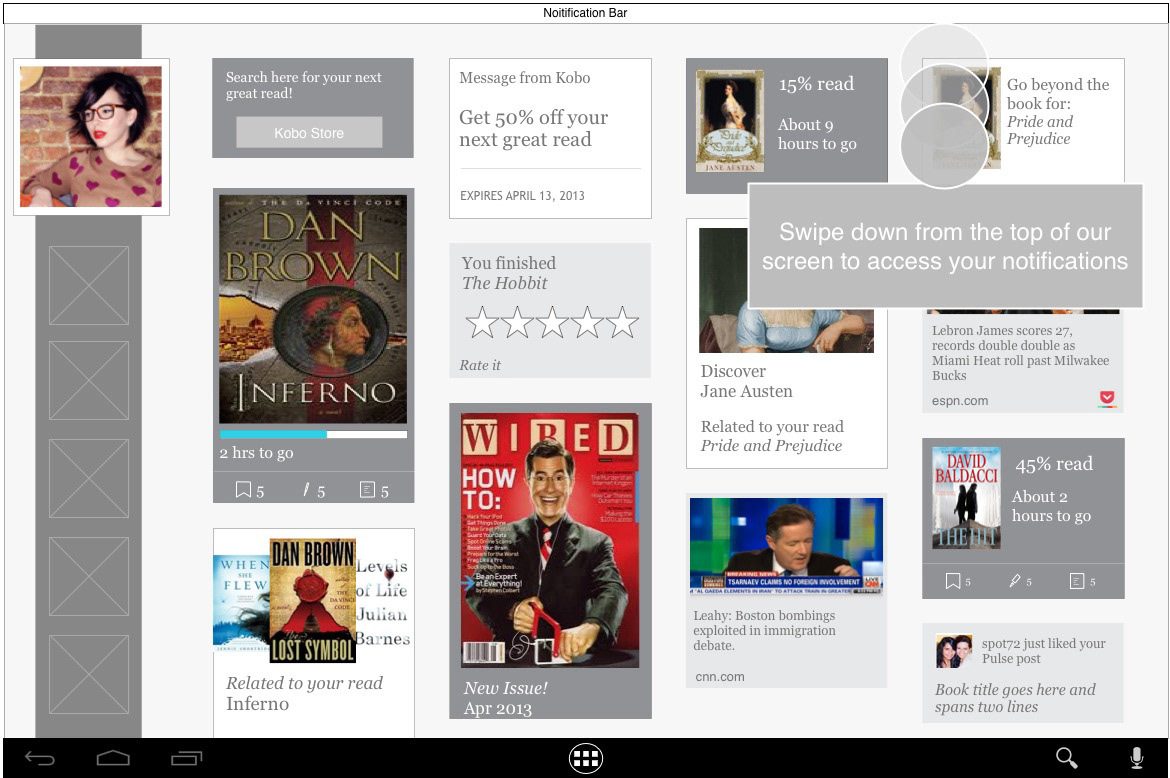
Wireframe of toast displaying the pull down gesture and where Android quick settings live.
Just in time toasts are small snippets of information designed to communicate one focused message. Included are callouts of specific interface elements or complex touch gestures.
They are designed to appear after a set number of user actions (measured by # of touch interactions with the interface). If the user discovers a gesture or engages with a feature on their own before the toast is scheduled to show, it is terminated and never seen by the user. The toasts themselves are displayed over a live interface, thus allowing the user to explore whatever is communicated to them right away. This design has the following attributes:
Interact First, Learn Later
Instead of a front-loaded tutorial, this system allows the user to explore and discover the interface on their own initially. If the user does not find something in a reasonable timeframe, a lightweight and obstruction-free toast appears, teaching them something small about the interface and its capabilities.
Smart and Customized
No two users will see the same set of toasts. For example, an experienced Android user will come in and directly go into all apps and pull down the notification and quick settings tray. This will deactivate all said toasts. This user doesn’t need help discovering those areas in the interface, and as a result will not get any. On the other hand, an Android newbie will see over time several callouts that teach them, one by one, the various elements of the interface.
Flexibility
We set out in solving the problem of teaching users how to pin and thus increase engagement with the feature. We landed with this system, which is capable of tackling a whole other set of problems we discovered through usability testing. For example, the discoverability of the notification tray to novice Android users. The toast design is flexible and can be used to callout several interface elements and gestures, related or not to the pinning feature.
This system, alongside the ingrained empty state CTAs, has enabled us to address the problem of educating the user on the pinning feature in a way that is more helpful and engaging. We have taken the approach of allowing the user to explore and discover the interface on their own and supplying information only when they truly need it. In addition, the help systems are flexible, allowing us to address an additional set of problems, such as how to add a book to the library or where to find all the apps on the device. Some of these problems may seem trivial to seasoned and experienced Kobo or Android users, however we hope they come a long way for the ones that don't.
The End Product

Empty state CTA of a custom collection.

How to add items to a custom collection flyout.

How to add books to a custom collection.

JIT toast highlighting where all your apps live.

JIT toast highlighting how to access Android's quick settings.

